Samsung Galaxy S25 Ultra design mockup compared to iPhone 16 Pro Max, Galaxy S21 Ultra: what’s new | Tech Tips
In how many ways can you change the appearance of a rectangular slab? Well, Samsung seems to be switching between angular and rounded or flat vs curved designs. The new Galaxy S25 Ultra mockup images suggest the phone could have slightly rounded corners than the Galaxy S24 Ultra. Well, we also get a side-by-side comparison of the S25 Ultra design with Galaxy S21 Ultra, Galaxy S20 Ultra, and even iPhone 16 Pro Max. Peer through:
Samsung Galaxy S25 Ultra design vs other big phones
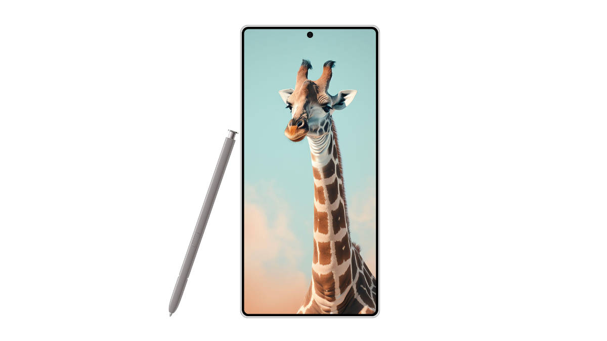
Tipster Ice Universe has shared these Galaxy S25 Ultra images. They seem mockup images and not official renders.
The first image shared shows just the supposed Galaxy S25 Ultra’s front along with a S-Pen. The phone has rounded corners, a central punch hole cutout, and slim bezels in this mockup.
Compared to the Samsung Galaxy S24 Ultra, you would notice the rounded corners give the Galaxy S25 Ultra a less boxy look. The roundedness will be comfortable on the palm too.
Well, it isn’t as rounded as the iPhone 16 Pro Max or the older Galaxy phones like the Galaxy S21 Ultra or Galaxy S20 Ultra. As the tipster remarks, the S25 Ultra design makes it appear more like a “Note” (remember, Galaxy Note lineup?).
While the corners are rounded, the rest of the perimeter is flat only. This should accept touches better (less chance of false touches like on a curved edge). The S-Pen will also be easier to use on a flat surface. A flat-screen is also less prone to abrasion. As we mentioned in our Galaxy S24 Ultra review, the flat design “makes screen protectors easier to apply”.
Rest, the phone is rumoured to come with a thin profile of 8.4mm, 45W charging support, Snapdragon 8 Gen 4 SoC, up to 5X optical zoom, a bigger and better ultrawide sensor, and a 200MP main camera.

