Nothing OS 3.0 announced with Nothing Gallery app, AI-based app drawer, and more: here’s its launch timeline | Tech Tips

Nothing OS 3.0 features and changes have been showcased in the recent launch video. Version 3.0, mostly based on Android 15, marks an important update as it is said to be the software Nothing “always wanted to make“. OS 3.0 comes with the long-awaited Nothing Gallery app, several customisation options and an AI-powered Smart Drawer that looks like the iOS app library inspired it. Here’s the full feature breakdown and launch timeline:
Nothing OS 3.0 features
- Smart Drawer: Nothing OS 3.0 uses AI to categorise apps and arrange the most used apps up top. It looks and functions somewhat like the iOS app library. This new app drawer is dubbed Smart Drawer and is an option you can turn on. The regular app drawer is still there and is available by default. You can pin your favourite apps on the top.
- Nothing Gallery and Camera App: There is a built-in gallery app now on Nothing OS. It works seamlessly with the camera app (around 1.4 seconds faster than the previous implementation). The camera app can also process HDR and portrait effects quicker (like 25 percent faster).
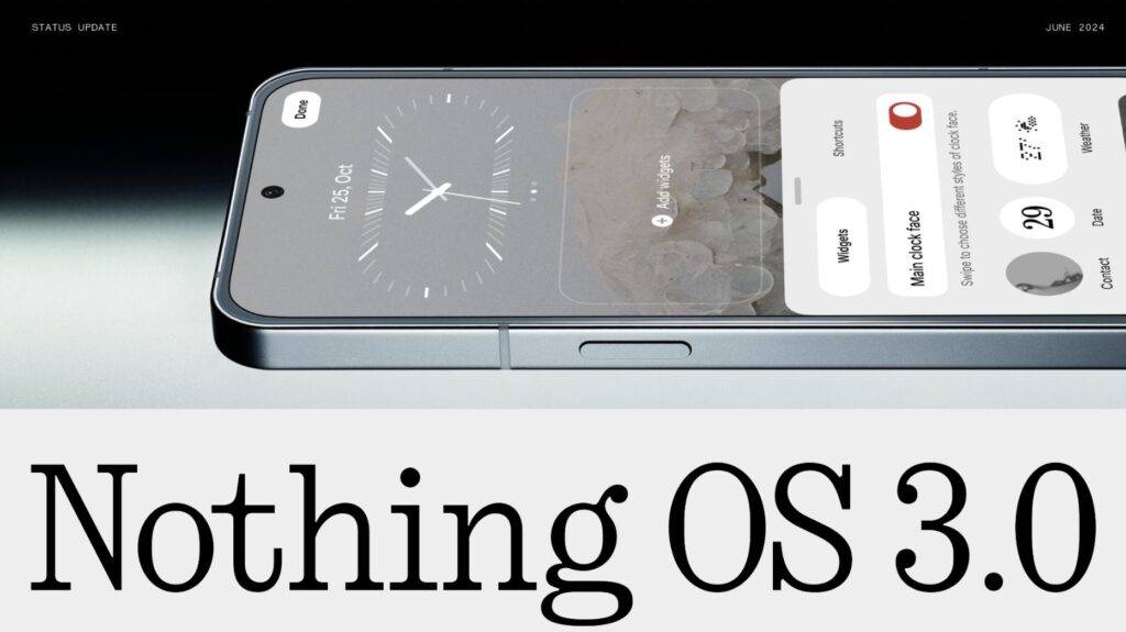
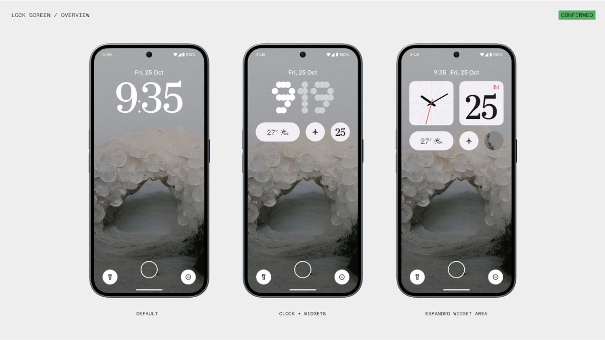
- Lockscreen clock and widgets: Nothing OS 3.0 allows more clock faces and widgets on the lockscreen. The new clock faces include N-Type, N-Dot designs, and one that looks like the clock on the London Underground rail station.
- Quick Settings tile arrangement: Quick Settings tiles are modular and can be resized and arranged as you like. Carl Pei calls it intuitive. There is also an auto-brightness toggle with the brightness slider now.
- Homescreen widgets: You can choose from over 20 built-in widgets including a countdown widget. Nothing OS 3.0 also allows you to share certain widgets like pedometer with other Nothing OS users for a connected experience. People can react with stickers on the shared widgets.
- New UI elements like font, Dot matrix, and Transparency: You will see new Dot Animations in fingerprint animations and charging indicators. The N-dot font is coupled with Sans Serif font for more readability. The Dot Matrix UI expands to apps like the Weather one wherein you’ll see animated weather icons. The brand has also teased new transparent software elements to better visualise data. We’ll have to see how this works.
Nothing OS 3.0 release timeline
The Nothing OS 3.0 beta rollout will begin in October. The eligible phone details aren’t out but we suppose Nothing Phone (2) and Phone (2a)/Phone (2a) Plus should be getting it. Meanwhile, the stable release is scheduled for December.
The post Nothing OS 3.0 announced with Nothing Gallery app, AI-based app drawer, and more: here’s its launch timeline first appeared on 91mobiles.com.
